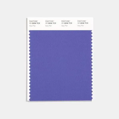
Announcing the new color of the year for 2022!
If you’re a regular follower of TLC Style & Colour on social media, then you’ll have seen the news of Pantone’s color of the year already.
Pantone have been doing this for over 20 years. They take many influences into account from across the globe and why does it matter? Well, the result is that their chosen shade of colour is reflected in products that you’ll be more likely to buy – from fashion to home furnishings.
2022
Last year there were two colours (read it here) and for 2022 there is just one colour (color) shade.
Introducing…..Very Peri
Pantone describe it as: “Displaying a carefree confidence and a daring curiosity that animates our creative spirit, inquisitive and intriguing PANTONE 17-3938 Very Peri helps us to embrace this altered landscape of possibilities, opening us up to a new vision as we rewrite our lives. Rekindling gratitude for some of the qualities that blue represents complemented by a new perspective that resonates today, PANTONE 17-3938 Very Peri places the future ahead in a new light.”
Who does it suit?
Well, it’s a shade of purple after all which is a universal colour to suit everyone! This particular hue (think blue and purple mix) should be easy to incorporate into your wardrobe – I’m certainly looking forward to it!
If you’ve got a wedding coming up, bridesmaids and mother of the bride or groom will look wonderful in shades of periwinkle. Choose a shade to suit their individual colouring and if it looks too harsh, consider the fabric and neckline or book a colour session with me!
Another tip is to think about the colour group if you’re struggling with the specific shade. Whilst it’s a fabulous bold shade for some, it may feel too bold for others. Try and combine it with other shades of purple – think amethyst, mauve, violet and lavender shades.
For you Cools, Clears and Deeps, it’ll look amazing due to the characteristics of the colour. It’s most similar to your bright periwinkle swatch. Warms, Lights and Softs will want to take it down a notch to the Light Periwinkle shade for it to compliment you the most.
Colour combos
Lights – try light periwinkle with light grey, pewter or dusty rose. An alternative shade to try would be violet.
Deeps – wear it with blush pink or aubergine.
Warms – try your light periwinkle with purple or primrose.
Cools – wear it with sky blue, charcoal or cassis.
Clears – try it alongside soft white, lemon yellow or light apricot.
Soft – wear it with damson, soft violet or sapphire.
Makeup
If you fancy experimenting a little with your makeup shades for 2022, look out for a new nail polish or gel?
You could also try and introduce a new eyeshadow shade!
The Colour me Beautiful ‘Delph’ eyeshadow refill (for the magnetic compact) is rather similar and for something with more of a punch there is also the ‘purple’ eyeshadow refill which suits everyone for that little bit of colour pop.
For help finding clothes or makeup to suit you, get in touch and I’ll be happy to help.
All makeup is available to order from the studio or get 10% off online orders. Be quick as it ends on 31 December!

